
Primary Typeface
Viksjow
The Viksjow Typeface is the main typeface used for all titles and headlines. Viksjow was created to compliment Jow’s warmth and personality. Headlines should be sentence case, capitalizing the first word in a phrase and any proper nouns.
Meet Viksjow,
a custom typeface
for Jow.
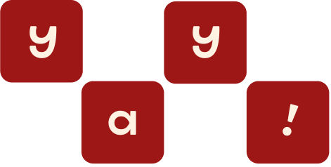

Glyphs & Ligatures
Viksjow comes with alternative glyphs to add more personality and fun into short headlines. These are to be used sparingly as an illustrative and playful moment. They should be used primarily as “decorative initials,” i.e. the first capital letter in a headline. Do not use them when the words are too small or in a long title.


.jpg)